Titulo

The initial designs for Cisco U were inconsistent, with various elements not adhering to a unified grid or style. The goal was to standardize these elements and create a robust design system that other designers could easily use.

Process

We worked with Cisco designers and an outside agency to define the initial look and feel, which encompassed the welcome pages, landing pages, and main pages of the platform.

Titulo

The Challenge

Written by Christoffer Pineda on .

The initial designs for Cisco U were inconsistent, with various elements not adhering to a unified grid or style. The goal was to standardize these elements and create a robust design system that other designers could easily use.

Process

We worked with Cisco designers and an outside agency to define the initial look and feel, which encompassed the welcome pages, landing pages, and main pages of the platform.
Asset Standardization

Written by Kathy Collins on .

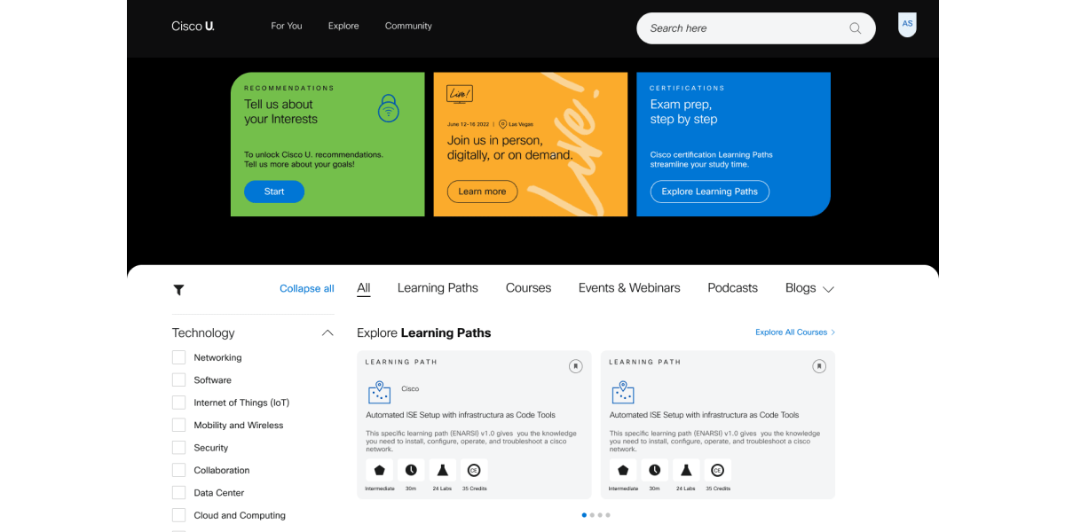
Updated all assets to fit within an 8-grid system, addressing inconsistencies in sizes, padding, and auto-layouts.

Creating Responsive Design Comps

Written by Kathy Collins on .

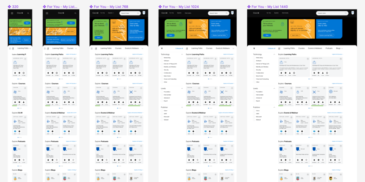
Once the desktop comps were completed and approved, I needed to create the responsive versions of the comps. After meeting with the engineering team, we agreed on 5 breakpoints to cover all devices: Phone, Table, and Web. I used the “Breakpoints” Figma plug-in to connect the comps and demo the responsiveness in real time.